+8
G man
Zenesis
Ndk_07
Shivam
The ???
T.O.R.N.A.D.O
Maxlance
AWSAN.awesome
12 posters
My awesome signatures
AWSAN.awesome- Leader Volkner
- HP : 39
EXP. Points : 4606
Posts : 338
- Post n°121
Re: My awesome signatures
Thank you very much..but a 10!a..10!!!YOHOOO finally the number i wanted to meet!
Maxlance- Pokemon Trainer Blue
- HP : 41
EXP. Points : 4983
Posts : 603
- Post n°122
Re: My awesome signatures
Keep on practising and you will get better and better !
Shivam- Leader Steven
- HP : 60
EXP. Points : 5385
Posts : 977
- Post n°123
Re: My awesome signatures
Woah, Didn't noticed this one! It's awesome 10/10!
Awsan, make more of these!
Zenesis- Leader Wallace
- HP : 36
EXP. Points : 4748
Posts : 592
- Post n°125
Re: My awesome signatures
i'm not really fan for pop up sig, "The Dragon" text need some more work,lighting look wrong,render didn't blend well,"Rayquaza" text need darker color (dark green),"Pokemon" text didn't help your sig (no point for that),border need work
- border example:
Maxlance- Pokemon Trainer Blue
- HP : 41
EXP. Points : 4983
Posts : 603
- Post n°126
Re: My awesome signatures
I am completely speechless at your work,Awsan !!
One of the best texts I have ever seen in this forum !!
Once again,10/10 !!
You deserve special praise for the innovation of popping out Rayquaza from the signature's limits and that too very elegantly !
I also liked the "misting" of Rayquaza !!
Border needs improvement but till now I didn't see "extraordinary" border in ANY of the signatures in this forum...
But I'm sure you will show that too soon..
You're a really fast learner,Awsan !!
btw,this is the 6000th post of the forum !!
Shivam- Leader Steven
- HP : 60
EXP. Points : 5385
Posts : 977
- Post n°127
Re: My awesome signatures
Hmm, I don't like like the lighting and the text a bit bad so 8.5/10. The thing I don't like in text is: "The Dragon" is taking too much attention.
Man, how did you improve so fast? Is there any awesome tutorial that helped or anything like that?
Last edited by Shivam on Fri May 03, 2013 3:15 pm; edited 1 time in total
T.O.R.N.A.D.O- Pokémon Trainer Red
- HP : 56
EXP. Points : 6190
Posts : 1965
- Post n°128
Re: My awesome signatures
The Rayquaza render is looking cute. Text choice is very nice. Effect of Rayquaza coming out is awesome. Overall rating 9.2/10!
G man- Leader Giovanni
- HP : 19
EXP. Points : 4300
Posts : 187
- Post n°129
Re: My awesome signatures
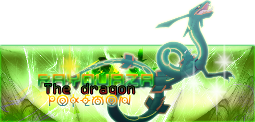
Zenesis wrote:i'm not really fan for pop up sig, "The Dragon" text need some more work,lighting look wrong,render didn't blend well,"Rayquaza" text need darker color (dark green),"Pokemon" text didn't help your sig (no point for that),border need work,overall rate 5/10, keep it up
- border example:
Sums it up pretty good.
AWSAN.awesome- Leader Volkner
- HP : 39
EXP. Points : 4606
Posts : 338
- Post n°130
Re: My awesome signatures
max:thanks man!!
zenesis:....i think render blends well and rayquaza text is good in this signature..same goes for g-man.
shivam: nope nothing like that,i just take alot of time making them now.thanks btw.
Tornado:Thanks man!
zenesis:....i think render blends well and rayquaza text is good in this signature..same goes for g-man.
shivam: nope nothing like that,i just take alot of time making them now.thanks btw.
Tornado:Thanks man!
Zenesis- Leader Wallace
- HP : 36
EXP. Points : 4748
Posts : 592
- Post n°131
Re: My awesome signatures
bcuz you think wrong that make i think and if want reject my comment/feedback don't use "C&C" (i try to help you but you didn't even try to learning :save the PSD file reopen it and repair where is wrong)zenesis:....i think render blends well and rayquaza text is good in this signature..same goes for g-man.
AWSAN.awesome- Leader Volkner
- HP : 39
EXP. Points : 4606
Posts : 338
- Post n°132
Re: My awesome signatures
well,u were right about the lightning and i fixed it....
Zenesis- Leader Wallace
- HP : 36
EXP. Points : 4748
Posts : 592
- Post n°133
Re: My awesome signatures
about text toowell,u were right about the lightning and i fixed it....
AWSAN.awesome- Leader Volkner
- HP : 39
EXP. Points : 4606
Posts : 338
- Post n°134
Re: My awesome signatures
aa...i dont think so..
Zenesis- Leader Wallace
- HP : 36
EXP. Points : 4748
Posts : 592
- Post n°135
Re: My awesome signatures
w/e it up to you
The ???- God
- HP : 54
EXP. Points : 5919
Posts : 1662
- Post n°136
Re: My awesome signatures
great job Awsan, I love it
Maxlance- Pokemon Trainer Blue
- HP : 41
EXP. Points : 4983
Posts : 603
- Post n°138
Re: My awesome signatures
siggy needs improvement,but don't get sad..
we all learn from our mistakes,after all !
Let me give you some tips-
1)First of all, the individual texts are excellent as always,but the TRICK lies in how you join them all !
2) There are TRILLIONS of border varieties and designs but it is not necessary that the most beautiful border will fit your siggy ..It may make it worser !
so, the magic lies in - give first priority to -blending the border with the siggy
after that you may try fancy borders but don't forget the above..
REMEMBER : you're making a siggy not a photo frame !
Shivam- Leader Steven
- HP : 60
EXP. Points : 5385
Posts : 977
- Post n°139
Re: My awesome signatures
Try changing border. Change the color and place of "Lucario" text. Do this and see what happens.
Shivam- Leader Steven
- HP : 60
EXP. Points : 5385
Posts : 977
- Post n°141
Re: My awesome signatures
It's much better now. 8.5/10
Maxlance- Pokemon Trainer Blue
- HP : 41
EXP. Points : 4983
Posts : 603
- Post n°142
Re: My awesome signatures
Yeah...v2 border is way better...
+Like !
+Like !
- Spoiler:
Try this for more improvement :
1) Thicken the colouring
2) Make the width of the border slightly thinner ...
I said this because lucario's body is still visible between the two border layers(see bottom right and top right of your siggy)
and a border in a siggy is just a boundary (which is present yet not so prominent) that separates it from the surroundings..
you have made such a border before...see the border in your Ninetales siggy !
sondos- Rookie Trainer
- HP : 20
EXP. Points : 4241
Posts : 128
- Post n°143
Re: My awesome signatures
Lookin' good!
pack5642- Leader Lucian
- HP : 15
EXP. Points : 4228
Posts : 93
- Post n°144
Re: My awesome signatures
wow! this is awesome. text is legit, c4ds are epic, good quality render, render well placed, good blending, nice border, and well placed render and text. the ooonly bad thing i can find is that lucarios (kamehamehaaaaa) is dark, wouldve looked epic if it were light.
Maxlance- Pokemon Trainer Blue
- HP : 41
EXP. Points : 4983
Posts : 603
- Post n°146
Re: My awesome signatures
Effects : 3/3
Text : 1/1 (Superb ! )
Text placement : 0.5/1
Bg: 1/2 (Nice but can be better)
Content and clarity (render modification,blending,etc) : 2/3
Overall : 7.5 /10
Tips:
1.Try adding more variety to bg rather than scrubbing ,scratching and brushing always (becomes monotonous)
2. Work on blending and flow of render , depth is OK !
Good job,Keep it up !
Shivam- Leader Steven
- HP : 60
EXP. Points : 5385
Posts : 977
- Post n°147
Re: My awesome signatures
Text placement and lighting needs a bit work. And I personly don't like those C4D(?) coming from above. 7/10
AWSAN.awesome- Leader Volkner
- HP : 39
EXP. Points : 4606
Posts : 338
- Post n°148
Re: My awesome signatures
thanks max! And shivam,i thought it would be cool if i made the signature break (an icy effect) ty anyway.
so it's background,render modification and text placement (maybe i will make two versions,1 with the breaking effect,and one with no breaking effect.
Zenesis- Leader Wallace
- HP : 36
EXP. Points : 4748
Posts : 592
- Post n°149
Re: My awesome signatures
my turn (it may hurt you feeling : learning purpose)
* "Aokiji" text too big and font didn't fit.
* "The Admiral" text effect didn't fit at all (need to blend more).
* Don't seperated the text =_= it will become messy (look carefully).
* Render didn't blend at all (remove outer glow).
Blending Rule :-
BG And Render Must Fit (Text As Well).
Example :-
- Apply Some Gradient Map
* Like Shivam said : Lighting need work bcuz your lighting wrong .
Lighting Rule :-
- Where The light Show And Where The Shadow Gonna Show.
- Where Bright Part And Where Darker Part.
* BG didn't really look like ice , Example :
* No depth : check back tutorial i gave you.
* Flow kinda messy (at BG).
* The border you did was nice (Be creative).
* Overall rate 3.2/10 to get better do what i tell.
i think you same level with yin
* "Aokiji" text too big and font didn't fit.
* "The Admiral" text effect didn't fit at all (need to blend more).
* Don't seperated the text =_= it will become messy (look carefully).
* Render didn't blend at all (remove outer glow).
Blending Rule :-
BG And Render Must Fit (Text As Well).
Example :-
- Apply Some Gradient Map
* Like Shivam said : Lighting need work bcuz your lighting wrong .
Lighting Rule :-
- Where The light Show And Where The Shadow Gonna Show.
- Where Bright Part And Where Darker Part.
* BG didn't really look like ice , Example :
- My Work:
* No depth : check back tutorial i gave you.
* Flow kinda messy (at BG).
* The border you did was nice (Be creative).
* Overall rate 3.2/10 to get better do what i tell.
i think you same level with yin
Maxlance- Pokemon Trainer Blue
- HP : 41
EXP. Points : 4983
Posts : 603
- Post n°150
Re: My awesome signatures
Awsan, you can try these type of backgrounds for " CRACKLING EFFECT" later when you get time..
ADVANTAGES:
1. The signature doesn't get cut off at places
2. You get a nice cool effect !
ADVANTAGES:
1. The signature doesn't get cut off at places
2. You get a nice cool effect !
- Spoiler:
|
|